Buffalo Sabres: Ranking the four most recent uniform sets

Since 1996-97, the Buffalo Sabres have unveiled four primary uniform sets. Some looked good, others, not so good. And others, historic.
We asked Buffalo Sabres fans on various social media platforms about their favorite primary uniforms from the 1996-97 and onward. There were four primary sets released during the time span, although the franchise may have made minor tweaks to the overall designs in some seasons.
These sets were:
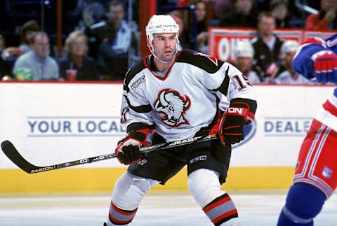
- Black, red, and silver bison-head uniform.
- The navy and gold arching bison.
- Navy and gold, with the original logo and chest number.
- Royal and gold with the original logo.
Some uniforms above were gimmicky, others historic, and one even a clash of modern and classic. The rankings in the following slides do not reflect what we thought of the uniforms. Instead, they are a product of what the fans on our social channels thought.
Here is how we ranked the four primary uniform sets: The set that earned the lowest number of first place votes took fourth, while the set with the highest number took first and won. The second highest number of first place votes took second, and the third highest finished in third.

No alternate uniforms for the Buffalo Sabres ranked
We did not count any of the Sabres alternate uniforms in this article. Therefore, the ill-fated gold jerseys shown above are not part of these rankings. And neither are the unforgettable Heritage Classic threads the team wore twice last season.
These rankings provided a big of a shocker, however. They showed us that Sabres fans love tradition, but they also love innovative designs. The uniforms that finished in fourth were not the ones that we expected. Nor did we expect one particular uniform set to run away in a landslide victory.
So who won and who lost in the 1996-present uniform rankings? Keep reading to find out.

2010-11 to 2019-20 navy and gold
In 2010, the Buffalo Sabres ditched their “Buffaslug” uniform and opted for something more classic, but with a twist. These navy, silver, and gold uniforms grew in popularity when they were initially used as the threads for the 2008 Winter Classic.
However, only 1.7 percent of the fans polled said these were their favorite uniforms, despite the modernized classic feel. These uniforms saw a few tweaks, like eventually removing the silver accents from the armpit area, which gave them more of a classic look.
They were also in use for over a decade – 10 seasons as the primary look and dating back to 2008 as an alternate uniform. But when the fans spoke, they finished dead last and trailed the eventual victors by a whopping 67.3 percent. But they didn’t lose by much to the threads that came in third place on this list.

2006-07 to 2009-10 navy and gold
Also known as the “Buffaslug” uniforms given their arching shape, the logo on this uniform further reminded me of a cheap spinoff from the Buffalo Bills logo, except it was yellow instead of blue. If I were ranking the uniforms, I’d have put these last, but a few fans were fond of them.
And it’s easy to see why: The Buffalo Sabres last won a playoff series wearing them. Hey, there have been bad uniforms in every major North American pro sports league that stuck around because teams saw success in them.
Truth be told, the navy blue uniforms looked sharper than I initially thought. However, the road whites were just bland. Beyond bland. By 2008, the Winter Classic/then-alternate look gained steam and by 2010, these uniforms were slated to become an asterisk in franchise history books.

1996-97 to 2005-06 red and black
Non-traditional uniforms can (rightfully) get a bad rap and see the door after just a few seasons, like the Buffaslug uniforms in the previous slide. However, others are just timeless, and it’s what the Sabres experienced with their red, black, and silver Bison Head uniforms.
No, they didn’t have the traditional color or logo. But who cares? These were arguably the sharpest, cleanest successors to a traditional uniform in the history of modern North American sports. And 24.1 percent of Buffalo Sabres fans ranked these as their favorite.
There have been recent rumblings that the Sabres will bring these uniforms back as an alternate. And why not? Although I prefer the Heritage Classic look, the Bison Head uniforms would make for an outstanding consolation. Especially if the Sabres are looking to honor the 1998-99 team that earned a trip to the Stanley Cup Final.

2020-present royal blue and gold
When the Buffalo Sabres unveiled a modernized version of their original uniforms, you knew they were going to catapult to the top of just about every credible uniform ranking. The most credible ones I’ve read often have the look in the top-ten, at worst. One ranked them in the top five.
Regardless, a whopping 69 percent of all Sabres fans ranked these uniforms as their favorite. And it’s easy to see why. Nothing screams timelessness quite like royal blue in the city of Buffalo, as the Bills wear an identical shade. Ironically enough, the Bills also wore navy blue for a while.
The charging bison, the crossing swords, complementary colors, and a look identical to what the famed French Connection wore, there is a lot of history in these uniforms. Don’t expect the Sabres to wear anything else any time soon. At least until another gimmicky era of uniforms encroaches the sports scene – like the 1990s through the 2010s.
light. Related Story. Atlantic Division uniform power rankings
Or if Nike takes over as the main supplier of NHL uniforms….yikes! I often shudder at some what they come up with in the NFL, MLB, and NBA. But for now, the Sabres have among the league’s cleanest, timeless looks of any NHL team when they wear these threads.