

Breaking down the rich history of the Buffalo Sabres logo

The Buffalo Sabres have one of the most iconic logos in the NHL, if not one of the most iconic in sports. Here is a breakdown of its rich history.
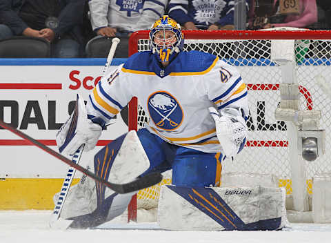
When you break down a list of the NHL’s most historic logos, the charging bison and crossed swords that comprise the Buffalo Sabres insignia probably tops the list. But few NHL franchises have two memorable logos, and the Sabres are also in that hallowed club, thanks to the goathead look from the mid-1990s and mid-2000s.
Besides enjoying multiple iconic logos, the Sabres have also found themselves wearing multiple color schemes, with the red and black drawing as much praise as the royal blue and gold. And yes, the team unfortunately did go through a dry spell when they went with a navy, silver, and gold palette between 2006-07 and 2019-20. But that has since changed.
Overall, you can consider the Sabres of today as having what arguably may just be one of the NHL’s most distinguished looks. Let’s break down the rich history of the franchise’s logo.
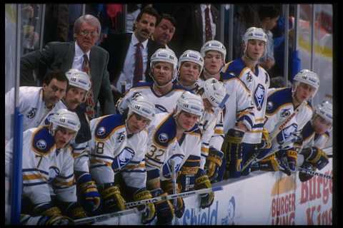
Breaking down the Buffalo Sabres logo’s rich history: 1970-96 – The Original
The Buffalo Sabres have one of the most interesting logos in the NHL because while there is a lot going on, there is also a lot of meaning behind it. Look at any other logo in hockey, and very few, I can only name one off the bat, serve multiple purposes – that being the logo of the Minnesota Wild, which is in the shape of an animal head.
Anyway, the charging bison, per Chris Creamer’s Sports Logos, has always stood for luck. You also see two crossing sabre swords in the logo, which generally signifies combat between knights or warriors. In the sports world, crossing swords represent the contest, or the game that is being played.
Knowing this, it shows us that the original Sabres had a complete logo, one that wishes the team good luck regardless of who they are playing either at home or during a road trip. And the crossing swords that debuted in 1970 serves as a constant reminder of the game that is being played.
Despite the iconic representation the crossed swords bring, the Sabres did not keep this logo forever. Upon moving into the KeyBank Center, then known as Marine Midland Arena, they radically designed both the logo and their color scheme.
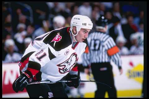
1996-06 – The Goathead
When the Sabres relocated to their new arena, they unveiled a radically redesigned logo and color scheme. The colors were now red and black, with a bison’s head, nicknamed The Goathead, gracing the front of the jersey. On the shoulders, you saw a secondary logo comprising a stylized ‘B’ with a sabre running through it.
This logo and color scheme, though non-traditional in every aspect, became a hit with the Buffalo Sabres faithful that remains popular to this day. So much, there are fans out there who would love to see the look return as a throwback. A few have even suggested bringing back the jersey as an alternate, but in the team’s current colors of royal blue and gold.
In professional sports, radically redesigned logos rarely work. So for the Sabres to have concocted a popular logo that deviated dramatically from their original, they joined a rare club. In January 2022, Sports Logos did report the Goathead would return as an alternate in 2022-23. However, there has been little talk of a potential return since then.
2006-10 – The Slug
The Buffaslug is arguably the most polarizing logo in Buffalo Sabres history. When interacting with fans, I have seen that some love it while others despise it. Personally, I have never been a fan of this logo that the team introduced in 2006-07, which only lasted until the 2009-10 season.
However, it was with this logo did fans see the team make back-to-back conference finals appearances, plus a Presidents’ Trophy. So as ridiculous as some may have believed Buffaslug to be, the Sabres won when it boasted its status as the franchise’s primary logo.
The Sabres also never logged fewer than 90 points in a season with Buffalslug. So maybe this logo should return based on the team’s track record in it? If you believe in superstition, this may be the logo for you! But, given the popularity of the team’s alternate look at the time that bore the classic logo, Buffaslug eventually lost the popularity contest.
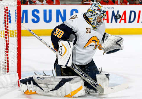
2010-20 – Navy, Silver, and Gold
In 2010-11, the Buffalo Sabres original logo returned, but this time in the navy, silver, and gold scheme that the team had used for the alternate look. Some have referred to the navy, silver, and gold version of the logo as a “modernized classic.”
Which if you looked across the entire sports world, this made a lot of sense, because many teams in the North American professional sports leagues were all busting out darker, more so-called modernized versions of their logos. A trend that actually started in the early 2000s.
For example, the Pittsburgh Penguins switched over to Vegas gold. And they are one of a few examples. This look, however, has proven not to be the most popular, with most fans embracing either the original colors or the Goathead era. So, after a long playoff drought and nothing but dysfunction following the logo’s first season as the primary in 2010-11, something amazing happened.
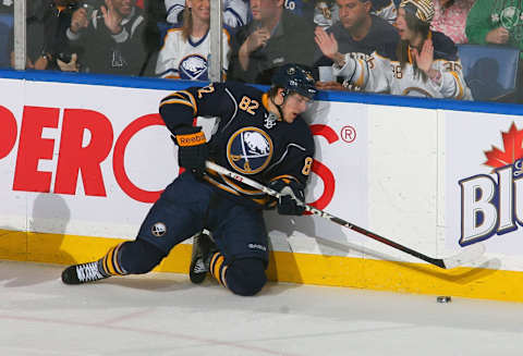
2020-Present – Return of the Original
Yes, the original logo returned on August 11th, 2020. But because of the COVID-19 pandemic, it wouldn’t take the ice until January 2021. This logo, as mentioned, is and has always been the most popular among the Buffalo Sabres faithful, which is likely the reason they brought it back for another run. Perhaps a permanent run.
And while the logo did not change the team’s fortunes during its first two seasons, at least the Sabres looked good on the ice from an aesthetic standpoint. At least until the latter half of the 2021-22 season when they finally came together as a team and started winning some thrillers.
The original logo, or a modernized version of the original to be more accurate as it possesses no ear on the bison and more overall detail and ridges at the legs, has a bright future ahead as we dive deeper into the 2020s decade. Look for this logo to remain a fixture for the Sabres if the team’s fortunes are reversed, and perhaps for the older logos like Goathead or Buffalslug to creep up every now and again as alternates or throwbacks.
Related Story. How did the Buffalo Sabres get their name?. light
Overall, the Buffalo Sabres rich logo history literally ran full circle. And when you look across the league, only a few NHL teams can say the same thing. Especially a franchise with over 50 seasons of rich history.
(Logo history information provided by Chris Creamer’s Sports Logos)