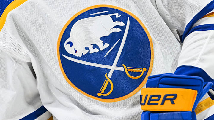
The Buffalo Sabres boast one of the most recognizable looks in the NHL, and its logo is one that literally emulates the team’s name inside the insignia, with a charging buffalo between a pair of criss-crossed sabre blades - hence Buffalo Sabres.
Creative, and the current incarnation of the dark uniform appears to be well-liked among over 225 voters on Chris Creamer’s SportsLogos.Net, where it currently holds a 6.1 out of 10 rating. Not bad, but what’s even cooler is that the Sabres goathead look has also seen a bit of a renaissance, giving the franchise not one but two memorable looks throughout its existence.
Oh, and the fact that the Sabres tend to win in the latter, don’t expect that late 1990s and early 2000s retro look to go away any time soon. So anyway, now that we’ve talked about those iconic uniforms of today, let’s walk back in time and discuss the quick history of the Sabres uniform.
Between 1970-71 and 1995-96, the Sabres uniforms strongly resembled what we see on the ice today, except for some minor variations in the team logo and in the striping. The 1970-71 through 1995-96 uniforms did make subtle upgrades, but it was nothing compared to the change that came for the 1996-97 season, something we saw a lot of NHL teams doing as the 1990s decade wore on.
Sabres uniform has a long, iconic history dating back to 1970
For the Sabres, it meant a switch from their classic blue and gold color scheme to black and red, and with it came the goathead logo. If you’re new to Sabres hockey, this is the uniform I was talking about earlier that has since returned as an alternate, again with subtle variations to fit the current times.
The polarizing navy blue, silver, white, and gold “buffa-slug” uniform followed the goatheads beginning in 2006-07, which simultaneously saw the Sabres take the Presidents’ Trophy in that look’s rookie season. However, the “buffa-slug” look only saw the ice until the 2009-10 season before the Sabres brought back something that sort of looks like what they have today.
The only problem with that uniform was that it was still navy blue, and it bore silver in the striping pattern and under the arms and piping down the front. Starting in 2017-18, the Sabres did away with the silver except for as an accent color in the striping pattern, and that look remained as-is until they brought back the royal blue and gold for the 2020-21 season and beyond.
As previously implied, this uniform strongly resembles what the Sabres wore between 1970-71 and 1995-96, but with an updated sleeker flair. Buffalo has also had a fair number of alternate uniforms in the past, including reverse retros, Heritage Classic looks, and one-off looks, but those would instead make for an outstanding topic for another article.
